Amazon Relay
Data Visualization
I led this project and designed the new dashboard for carriers used by more than 1 million users to book, manage and operate their trucking business.


Accessible through multiple devices
My Role & Responsibilities
Lead Designer
I led strategic vision, defined success metrics and development plan to launch.
Fostered cross-team communication and collaboration within 6 teams, including product managers, and designers, to identify inter-dependencies in design and development.
Success Metrics
120%
Reduction in coordination time
Newly introduced pinned trips feature estimated to save upto 20 mins/trip of coordination time between drivers and their carriers.
740%
Increase in Efficiency
Upfront categoarization of tasks was found to be effective when compared to current task sheet feature
90%
Boost in performance
Users expect that the visibility to Support Cases feature on dashboard will help in improving their performance score.

Old version(2017)
Provides basic actionable items.
No hierarchy for user to follow through the dashboard.
Lack overview of the business and current dependencies.
Underutilization of the real estate.
New version(2023)
Prioritizing the critical tasks for the user.
Operating and monitoring the business made easy.
Upfront metrics and visualizations to analyze the status.
Status and overview provided under few minutes.

To understand and define the big picture of the problem and opportunities we might leverage upon.
UX Canvas

How might we help carriers to thrive in their business by enabling them to increase their performance and stay compliant?
Insights from collaborations
We conducted two surveys and organized two user testing sessions to identify the challenges faced by users while using the relay for carriers and to understand their expectations. These efforts aimed to gather valuable insights directly from our user base. Additionally, I incorporated data collected by other esteemed teams such as the Trips team, Contracts team, and Notifications team. By leveraging their data, we gained a more comprehensive understanding of user needs and were able to develop a well-informed strategy moving forward.


Design Considerations
Limited and right visualizations
Choosing between the different type and number of visualizations to showcase the information was important. I chose a mix of numbers and charts for quick analysis and actions.
Analytical with a glance
To provide the user with at-a-glance information used for analysis and decision making with actionable components.
Operational and actionable
The main goals of the operational dashboard are to present data deviations to the user quickly and clearly, show current resources, and display their status. It’s a digital control room designed to help users be quick, proactive, and efficient.
Accessibility
Making it available to a wider group of customers and a step towards making them feel inclusive. Using text buttons over icons, icons accompanied by texts, navigable using the keyboard and testing it with users with special needs.
Users and Context

Adam Caar
Carrier (Owner/manager of trucking business)
Being the business owner/supervisor I need to know the whereabouts of drivers, find work for them, and make sure that my business thrives. These carriers get paid by Amazon for transporting goods. Carriers can book the work/loads using Amazon Relay as per their preferred locations, work hours, driver type, etc.

Simon Guidice
Dispatcher (Handles scheduling and communications)
I am involved in day to day execution, including booking and assigning work, interacting with drivers/ROC/Operations teams, Requesting Support for In Transit issues, etc. These carriers get paid by Amazon for transporting goods. Carriers can book the work/loads using Amazon Relay as per their preferred locations, work hours, driver type, etc.
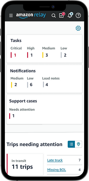
The new dashboard design
1. Trips management system for the higher performance score
As per the survey results from 3268 responses Trips card was found to be a highly prioritized card by carriers to manage their upcoming and in-transit trips. This card enable them to check status, categorize the issues occurring and let carriers resolve the issues without overwhelming them.
Pinned trips was also introduced to pin few of those trips which could lead into potential issues so as to resolve them on time to avoid any delays and degrading their performance score. It lets them monitor the status of trips and drivers without interrupting the drivers while driving.


2. Upfront categorization of tasks and notifications
The objective was to provide easy and upfront navigation for critical tasks and notifications to avoid scanning long lists of notifications/task lists.
Tasks and notifications showcased with the associated priority levels helps users in decision-making.
Resolving all their critical tasks improves their performance rating and helps them to stay compliant.


3. Smart Load Recommendations (AI-powered)
Designed AI-powered recommendation system that analyzes carriers booking patterns and preferences to suggest the most relevant loads and makes work discovery effortless. The algorithm continuously learns from past booking history and saved searches to deliver increasingly personalized recommendations. This approach reduced load search time by 53% and increased booking completion rates by 68%, making monitoring and booking loads faster for Amazon’s 1 million+ carriers.


Design Challenges
Limited choices of interaction patterns
Amazon's transport team abides by the meridian guidelines especially designed to maintain consistency across all the transportation products. While meridian guidelines have been a great resource to choose interaction patterns it did lack in visualization aspect, especially while designing the dashboard and for accessibility.
Review with Accessibility Advisory Hours (AAH)
Our team has partnered with an external organization to review the products for accessibility which delays the process in terms of coordinating the review sessions with AAH.
Collaborating with multiple teams
Relay for Carrier is a widely used product with multiple teams functioning across the continent. Collaborating with the teams brought in challenges as well as great perspectives to these design considerations for the new dashboard.


Newly designed Relay for Carriers portal used by more than a million users worldwide.
Future Scope
Customization
Carriers were able to quickly find any information we requested, but some carriers and their managers focus on specific activities (trip support, payments, learning, performance). Due to the user role-specific priorities, additional options for customization of the dashboard view would be beneficial.
Simplifying the system ambiguities
Resolving a few more Relay system ambiguities like 3(Critical/high, medium, and low) categories for the tasks than displaying 4(Critical, high, medium, and low).
Achieving the CSAT and SUS score of 68+
Post-launch of the new dashboard of the Relay for Carrier we aim at achieving high CSAT scores and SUS scores of 68+.
Integrating Map view
One of the complex and high in demand feature is to build and integrate real time map into the trip cards for the most accurate location of the drivers.
Takeaways